
King Willem-Alexander and Queen Máxima of the Netherlands spent a busy day in the region of Zeeuws Vlaanderen today with visits to Terneuzen, Hulst, and Sluis before officially opening the Sluiskiltunnel. For this event, Queen Máxima wore a new picture hat in pale pink straw.


Trimmed simply with a wide ribbon and bow around the base of the crown, this hat was all about scale- scale gained from a large brim that gently curved upward on one side. It’s a lovely hat that unfortunately, did not wow as Máxima’s hats usually do. And why not? Colour issues. The peachy pink hue of this hat is so close to Maxima’s skin tone that the two begin to oddly blend together. While this could be balanced the right outfit, the clash between the pink hat and the golden yellow skirt and tunic (which, to be honest,is a disaster on its own) does nothing to help. Pink and yellow can be a beautifully fresh combination when done right but this is so very, very not right.


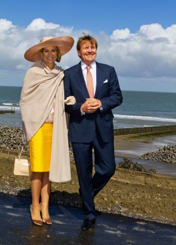


Designer: Fabienne Delvigne
Previously Worn: This hat is new
It is not often that a royal picture hat doesn’t work for me but I’m afraid, this one is one of the few. Queen Maxima has a similar hat with a smaller brim in a slightly different shade of pink that I think is a better hat for her. What do you think?
Photos from Patrick van Katwijk, Patrick van Katwijk, Patrick van Katwijk, Patrick van Katwijk, Albert Nieboer, Patrick van Katwijk, and Albert Nieboer via Corbis

A rare miss for Maxima. I like the hat shape but it lacks something in trim. The color is not the best for Maxima, but she might have gotten around that with another outfit. If she’s traveling we could always blame on poor staff packing!
Hat Queen, your completely right in that the first hat in your link was a much more elegant hat, this hat is to big for her features, she is dwarfed in this hat. Her outfit is a horrible ensemble of whatever she pulled from the bottom of her garage of clothes, first, very ill fitting clothes, pinks and yellows are hard to coordinate, the hat pins look like weapons she can pull out and defend herself, the shoes well …………in other words as an other poster said………..A complete mess! The cape looks gray to me on my computer so wondering what color it really is.
I like the scale and color of Queen Maxima’s hat. Dislike: limp bow, long hat pins, and her outfit. A yellow hat would have been better. Surely, hat pins are available in different lengths?
Queen Maxima’s hat is made of the most exquisite straw and I like the unusual peachy pink hue of it. Unfortunately, the colour is very unflattering to her complexion. I also don’t like the trail of ribbon that you can see as a shadow from the front, as others have said. As for those lethal looking hat pins, they are very ugly. The similar hat she wore which is pictured in the above link, is much more flattering to her and a better hat overall. I don’t like pink and yellow usually, because it is very hard to make it work. I don’t like the ill-fitting pale pink top with a big yellow splodge on it, because it looks like one of her children was running around with a paintbrush and collided with her. The skirt creases badly. The yellow is loud and doesn’t go with that peachy pink hat. I don’t like the beige wrap, because it is drab and shapeless and doesn’t coordinate with anything else she wore.
Turns out I was just repeating what Jake said (and said better). So, go Jake.
I will read more closely next time.
I don’t think what I often write on here is terribly eloquent, but I appreciate your confidence! Don’t worry, repeat away!
This hat is lovely. I honestly think this outfit would be fine – or more than fine – withou the shawl. The blouse appears to have a blush tint to it that works with the hat, but the beige wrap just wipes that out.
When I first saw these photos, I worried over her shiny, satiny shoes on wet pavement. Easy way to ruin shoes. Then I looked closer and saw that the shoes, skirt and hat all complimented each other and understood why she put these together. I think the hat (minus pointy pins in back) is lovely and lovely on Max. I especially love the size and the interesting folded bow in the side
My thoughts exactly! Aside from the shawl, I think she looks wonderful! I especially love the way she’s looking at her husband in one of the photos.
This hat takes the features of her famous slice hats, but pulls the brim down in the front; I suspect this is to show off the bow. The result makes the front of this hat seem a bit heavy. It’s certainly a nice hat, but not nearly as successful as others in very similar veins she’s worn in the past. I think if she had wore a fitted dress all in the lemon color of her skirt, this might’ve been a very successful ensemble. For me, the worst part is actually the wrap, which is very drab and I think the thing that washes her (and the whole look) out the most. Hints of awesomeness here, but overall most unfortunately not a win.
Interesting point about the colour of wrap. You may very well be right that it is washing the colour out of the top. Good spotting!
My eye does not know where to rest on this whole ensemble which is a mishmash of styles and colours that don’t belong together. The skirt in highlighter yellow is much too harsh for the pastels she is wearing. She needs to pick one theme and go with it. As for the hat – I like the shape but the colour isn’t doing her any favours.
Patsy, you are absolutely right. I much prefer the hat she wore in the link HatQueen provided.
Another thought about her hat pins. I wonder why they cannot be designed to fit UNDER the band around the hat? Surely any good stylist could figure out to work out a better way to conceal these distracting pins?
I agree, and you can buy hat pins that come with a blunt tipped cover that you can put on the sharp ends after the pin passes through the hat.
I am impressed that the Queen Máxima’s hat goes so nicely with the King’s necktie, but her outfit itself really isn’t any good. Since nothing is coordinated, one concentrates on the hat and only notices its hugeness.
I looked at your link to the similar pink hat QM and I was stunned to see how beautiful she looked in the previous hat which makes me think that the color of this current hat is not the color of pink-peach that works with her coloring. There is nothing g wrong with the style of the hat.
Even though this yellow outfit is not my favorite, both the yellow clothing and the pink-peach hat might work on her if they each had a different pairing. Maxima always looks good regardless of what she wears because she seems to be such a happy, smiling person who is in love with life.
What a mess! Even when I cover up the skirt with my hand over it on the photo, the outfit still does not work – the blend or contrasts just are not there. I could have done better putting an outfit together for myself at age 5!
This is a very nice hat. The reason you see the ribbon trailing is because the of the hat’s exquisite fine exotic straw material. I suspect that this is rare vintage stock.
Obviously, the hat pins do their job: the hat sits perfectly on her head. (Last time I was at the Dutch coast, it was quite windy)
Lastly, it seems to me that there are very different “measuring sticks” for different royals: I ‘ve seen some pretty hideous ensembles get a “pass” or even praise.
Do I love the look? No, I don’t. But is it bad? No, it’s not.
I like the hat….and I don’t hate the outfit…but they are not meant to be together. As much as I like to give Maxima props for her hat collection and willingness to be creative in her attire, this doesn’t work.
As a big fan of Max’s let me say that I don’t hate the gold/beige combo (although it looks like the skirt wrinkles) of her outfit. And, from the neck up, I don’t hate the hat. But together … the only thing I wonder if this is a case of a colour not photographing true (the bane of a wedding photographer’s life – the brick-red bridesmaid dresses come out brown). Unfortunately, her hat matches the colour of Wax’s tie so well that maybe I can’t get her off the hook. And those darn hat pins, aargh. I also don’t like the way the shadow of a trailing piece of ribbon can be seen through the brim in the photos. Not a good day in the Maxima office.
The hat in it’s own might be okay, but the outfit is a disaster. When she gets it right, it’s amazing. When she gets it wrong, it’s awful. This is one of those times. Absolutely nothing she has on, works with anything else. And what is with the oddly placed hairpins?
I like the hat – but probably not on Queen Maxima. I keep trying to solve the mystery of her hat-pin placing strategy. She’s wearing her hair in a low chignon and the pins are placed so high that they can hardly catch any strands and if they do it looks painful. Or does this hat feature some contraption inside the crown that is caught by the pins? Or are the pins simply ornamental? It’s not the first time I see her wear a hat with two very high placed hat pins.
I think the hat is lovely actually. It’s just this outfit (hmm, not really an outfit is it, just a selection of clothes dropped on the floor, which somehow have made it onto lovely Maxima) is so terrible. The pieces are fine on their own, but together…. Pair this hat with an elegant suit and I think it could be very different…?
Very pale colouring and the hat is far too large. Blouse fits poorly. Makeup is too natural , no colour. Everything is a miss.