
Queen Elizabeth, The Duke of Edinburgh, The Duke of Cambridge, The Princess Royal and Vice Admiral Sir Timothy Laurence attended a service at Runnymede Meadows in Surrey this morning to mark the 800th anniversary of the sealing of the Magna Carta. Queen Elizabeth repeated her pale blue-grey straw hat with teardrop shaped crown and curved black brim, edged in a wide stripe of the same blue-grey fabric as her coat. The shape of this hat has always seemed a little catroonish to me although I must compliment the balanced use of the two contrasting colours.
Designer: Angela Kelly
Previously Worn: June 1, 2013; June 11, 2011; May 4, 2010; April 1, 2010; October 27, 2009
Princess Anne repeated a navy crin headpiece trimmed with navy feathers. In the past, Princess Anne has worn this in the middle of her head and I appreciated today’s placement, set off on a gentle angle to the side.
Designer: unknown
Previously Worn: November 15, 2008; June 17, 2004; June 19, 2001 and likely, multiple others
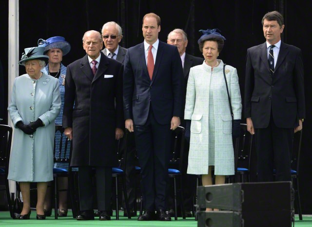
In their multiple shades of pale blue and navy, don’t you wonder if the British royals today had a deliberate plan to coordinate their appearance for this engagement today?!
Photos from James Whatling/Splash News via Corbis and Getty as indicated

I really like this hat of the Queen’s, shape and all. I’m trying to imagine it with a straight-sided or flatter crown, but I don’t think it would necessarily be an improvement. I like the trim which is quite sharp and defined compared to many, which gives it a welcome edge. (I don’t even mind the coat buttons and trim – from the distance the outift still looks very plain!)
Princess Anne’s hat is pleasant in itself, and I quite agree about the placement being better this time. But to me, somehow, the gauzey effect of this hat isn’t the right complement to Princess Anne’s very solid hair!
Wow Anne looks like she’s wearing clothing from this decade……really nice!
I like the use of black on this hat, just the right amount!
Will you briefly cover HM’s appearance at the Cartier Gold Cup over the weekend Hat Queen. (It was an incredibly full weekend!!). I think the hat was worthy of a mention and I’m keen to hear what everyone thinks of it! (Apologies if I’m being too forward). Thanks.
I will include it in our extras this week. Unfortunately, there have not been photos released that I am able to legally use.
Thanks for the explanation.
The Queen’s hat is too cartoonish in shape for my taste, but I do think this shade of blue flatters her, and I like the black contrasting trim. I don’t think the cut of the coat is flattering, and the patterned trim on the coat plus the patterned buttons is overkill. The Princess Royal looks chic today, in her simple, elegant suit though I don’t like the huge pockets. I actually like the navy crin headpiece trimmed with just the right amount of navy feathers this time around. I agree with HatQueen that today’s placement, set off on a gentle angle to the side, is a great improvement on the previous placement. As so often is the case with hats and headpieces, placement matters!
Anne looks fab – almost approaching chic, warms my heart. I like the dark underbrim of the Queen’s hat and don’t mind it’s shape. However, I don’t like the patterned trim on the coat with the patterned buttons. One or t’other would be better, IMO.
I’ve always liked this outfit on Her Maj, but have to say I thought it had been retired by now. I really don’t mind the shape of the crown – known as Sam the Eagle (from the Muppets!) due to its resemblance, in the old days of a long lost blog!
Glad to see I’m not the only one who remembers the name Sam the Eagle from olden days gone by in royal hat blogs! I think HM looked quite wonderful. Glad to see Anne not plop this piece right on top of her head again; it definitely needs to be at a bit of an angle to be successful, and she is successful this time!
I think the Queen’s hat, from straighten at least, is attractive. The black brim adds interest to the rest of the hat, and the black feathers provide add added height for the Queen. From above (picture 3) the hat is a little cartoonish.
I also like the fact that the trim on the Queen’s coat is the material from the dress. This is more interesting than the standard dress-matches-the coat ensembles (although there appears to be a matching light blue dress for this coat as well — a rare use of one coat for two dresses on the part of the Queen).
HM and Princess Anne in pale blue coordinating outfits as you noted. They both look good and the Queen is very animated. Anne has considerably “upped her game” fashion-wise; she looks most stylish in this ensemble. (And the dog is indeed beautiful!)
QEII’s hat is a little too cartooish for me – but least the crown on this one is not overly large. The colors are nice and the feathers are not sticking WAY out there like sometimes some long feather adornments are. ‘Tis interesting how they are all adorned in blue – there must be some significance to blue and the even or maybe the Magna Carta.
Princess Ann looks nice. Simple straight lines on the coat and the hat goes well with her hair. Congratulations Princess Ann.
The Queen’s hat is better than most lately …the colour is good…I am not even looking at the coat.
That beautiful dog is the overall winner.